Design Evolution of Some Famous Corporate Logos
Apple Inc.
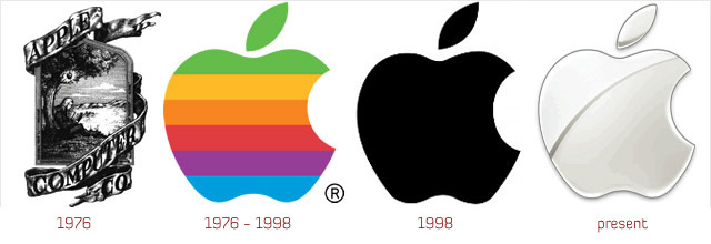
The first Apple logo was a complex picture of Isaac Newton sitting under an apple tree. The logo was inscribed: “Newton … A Mind Forever Voyaging Through Strange Seas of Thought … Alone.” It was designed by Ronald Wayne, who along with Wozniak and Jobs, actually founded Apple Computer. In 1976, after only working for two weeks at Apple, Wayne relinquished his stock (10% of the company) for a one-time payment of $800 because he thought Apple was too risky! (Had he kept it, Wayne’s stock would be worth billions!)
Jobs thought that the overly complex logo had something to do with the slow sales of the Apple I, so he commissioned Rob Janoff of the Regis McKenna Agency to design a new one. Janoff came up with the iconic rainbow-striped Apple logo used from 1976 to 1999.
Rumor has it that the bite on the Apple logo was a nod to Alan Turing, the father of modern computer science who committed suicide by eating a cyanide-laced apple. Janoff, however, said in an interview that though he was mindful of the “byte/bite” pun (Apple’s slogan back then: “Byte into an Apple”), he designed the logo as such to “prevent the apple from looking like a cherry tomato.”
In 1998, supposedly at the insistence of Jobs, who had just returned to the company, Apple replaced the rainbow logo (“the most expensive bloody logo ever designed” said Apple President Mike Scott) with a modern-looking, monochrome logo.
Ford
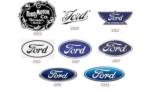
Henry Ford used to work for Thomas Edison. He founded two companies before settling on Ford. His first company went bankrupt after just two years, and he left the second company after just one year. However, the second company became Cadillac later on. His third company, founded in 1902, was called Ford & Malcomson, Ltd.
He was unable to pay the bills for parts in his third company, but some investors agreed to put money in the company, and it was renamed as Ford Motor Co. This is the company name in the first logo of 1903. The 1909 logo, which has a similar font as today’s logo was borrowed from Childe Harold Wills, who had made this font for his business card.
In 1912, the Ford logo was given a complete makeover, as compared to the earlier simplistic design. When the Model A car was launched in 1927, the famous blue oval was introduced in the logo. This was the shape and color, on which all future Ford logos have been made.
The company has experimented with different shape going from ellipse to circle, and even a diamond like shape in 1957. The 1976 logo was essentially, the last major change in the symbol, and is very similar to their current logo. Finally, in 2003, the company released a new logo, which came to be known as “Centennial Blue Oval”.
Canon

The company had always wanted a global perspective, and the logos reflected the same as early as 1934. A specialized advertising designer had created the logo which included typeface never seen before in Europe or North America.
The first camera launched by the company in 1934, was named as Kwanon, after the Buddhist goddess of mercy. The logo included the wordings and a picture of the goddess with 1000 arms and flames.
As the years went by, like all other logos we have seen above, the company strived to make the logo as simple and memorable as possible. The logo had only been trademarked in 1935, and after that a lot of designing work went into making the logo more balanced. After 1956, the logo hasn’t been changed, but the designing effort is clearly visible in their simple but classic logo.

The clarity of thought is visible in the company’s logo right from the very beginning, when in 1996 two Stanford University computer science graduate students Larry Page and Sergey Brin built the search engine.
The name of the search engine is derived from Googol (meaning one followed by 100 zeros). Google’s first logo was created by Sergey Brin, after he taught himself to use the free graphic software GIMP. Later, an exclamation mark mimicking the Yahoo! logo was added. In 1999, Stanford’s Consultant Art Professor Ruth Kedar designed the Google logo that the company uses today.
Firefox

An open source web browser, created by Dave Hyatt and Blake Ross, was first of all named as Phoenix, which is visible in their first logo in 2002. Due to some trademark issues, the name had to be changed to Firebird, but the name was chosen so that they would be able to retain the same logo.
Unfortunately, this name also had trademark issues because of existing software. Then, they finally got lucky and chose the name Firefox, which has become one of the favorite and most used browser worldwide. In 2003, the now famous logo was designed by professional interface designer John Hicks.
The logo depicted a Firefox engulfing the whole world, which also signifies the global reach that the company strived for. There has been a minor change in the logo since then, with the colors of the continents using a lighter blue color, just to differentiate them better from the oceans.
Microsoft

The Microsoft story began in 1975, when Bill Gates and his friend Paul Allen coded the first computer language for a PC and named it BASIC. Soon they named their partnership as Micro-Soft which explains the first logo of the company.
They changed the logo in that year itself and dropped the hyphen too. For the next 12 years, the logo had a distinctive O. The employees called this as “Blibbet”. It is said that at that time, the Microsoft cafeteria even had a double cheeseburger named “”Blibbet Burger”.
When a new logo came on in 1987, there was a campaign within the company to “Save the Blibbet”. But, this couldn’t stop the company from adopting a new logo. The logo designed by Scott Baker, came to be known as “the Pacman logo” due to the distinctive cut in the O.
In 1994, they integrated their tagline ‘Where do you want to go today?’ within the logo. This was widely mocked and the company kept trying different taglines like People Ready, Start Something, Making it Easier etc.
The new 2008 logo has all the text in Italics (including the tagline), but the look of the logo has remained pretty much the same. Basically, the company is so well renowned already, that I don’t think the logo needs to change, since people already recognize and connect with it worldwide.
WWF – World Wildlife Fund
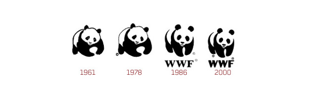
WWF’s world renowned panda logo was designed by its founder chairman, the naturalist and painter Sir Peter Scott, in 1961. It was then that WWF-UK, the first national organisation in the WWF international network, was started. The WWF logo has an immensely appealing and positive image, which is seen as caring, responsible and credible. This in turn means an inherent emotional and commercial value is attached to the use of the logo, reflecting their appeal and values.
FedEx

The original Federal Express logo was designed by Richard Runyan in 1973. It consists of the name ‘Federal Express’ in a diagonal position with blue and white background. Following the expansion of the FedEx’s courier business into a company offering overnight courier, ground, heavy freight, document copying and logistics services, FedEx logo experienced an innovative change. In 1994, Lindon Leader of Landor Associates created the new FedEx logo which has become a highly recognized corporate symbol of FedEx Corporation. Behind the FedEx logo’s simplicity, lays an arrow located in the negative space between the ‘E’ and ‘X’ pointing rightwards. While the arrow in the FedEx logo becomes quite obvious when pointed out, it sure is neglected by many. This arrow in the FedEx logo has been used as a form of subliminal advertising of the brand, symbolizing forward movement and thinking.
XEROX

The Xerox Company used to be known as the Haloid Company almost 100 years ago. But in 1938, Chester Carlson invented a technique called xerography which we today call the photocopy technique. Unfortunately no one was willing to invest in his invention, and many big giants like IBM, GE, RCA and others decided not to finance this invention.
But Haloid Company decided to go with Chester and made the first photocopying machine named Haloid Xerox 14. As can be seen in their logos, the original Haloid word which was prominent in the company’s logo before 1961 was completely replaced by Xerox due to the immense success of this idea.
They retained almost the same logo from 1961 to 2004. But in 2004 there was a problem with the Xerox books and it tried to reinvent itself with a new logo. People associate the company only with photocopy machines, and that has been a major problem for Xerox.
The company changed its logo in 2008 to get away from this stereotyped image, by changing the font of the word. They also added a ball which has a stylish X instead of their ‘boring’ X in earlier times According to Anne M. Mulcahy, Xerox’s chief, that little piece of art represents the connection to customers, partners, industry and innovation.
Ford
Henry Ford used to work for Thomas Edison. He founded two companies before settling on Ford. His first company went bankrupt after just two years, and he left the second company after just one year. However, the second company became Cadillac later on. His third company, founded in 1902, was called Ford & Malcomson, Ltd.
He was unable to pay the bills for parts in his third company, but some investors agreed to put money in the company, and it was renamed as Ford Motor Co. This is the company name in the first logo of 1903. The 1909 logo, which has a similar font as today’s logo was borrowed from Childe Harold Wills, who had made this font for his business card.
In 1912, the Ford logo was given a complete makeover, as compared to the earlier simplistic design. When the Model A car was launched in 1927, the famous blue oval was introduced in the logo. This was the shape and color, on which all future Ford logos have been made.
The company has experimented with different shape going from ellipse to circle, and even a diamond like shape in 1957. The 1976 logo was essentially, the last major change in the symbol, and is very similar to their current logo. Finally, in 2003, the company released a new logo, which came to be known as “Centennial Blue Oval”
FIAT
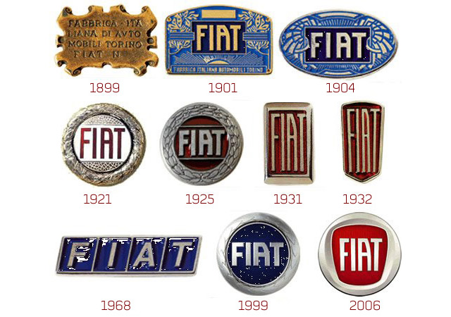
Fiat, then named Fabbrica Italiana Automobili Torino (Italian Automobile Factory of Turin), was founded in 1899 by a group of investors, including Giovanni Agnelli who later became its Managing Director. Agnelli bought his shares for $400 (about $10,000 in 2007 money). It’s worth billions now, and there had been an Agnelli in Fiat management ever since. Regardless or perhaps because of its wealth, the Agnelli clan remained a fractious and complicated group of people.
Supposedly, the famous Fiat “scrabble tiles” logo of the 1960s was designed by the company’s Chief Designer who was driving past the Fiat factory during a power outage and saw an outline of the factory’s neon sign against the dark sky.
Nestle

The Nestlé logo was launched by Henri Nestlé in 1868 on the basis of the meaning of his name in German, i.e. little nest, and of his family emblem.Henri obtained a 15-year French patent for his logo in 1868. After he retired, it was registered in Vevey in 1875 by the new owners of his company.In 1938, the traditional nest design was combined with the “Nestlé” name to form what is called the combined mark.In 1966 the design was simplified. In 1988, the worm in the mother bird’s beak was removed and the fledglings became two instead of three. It is said that it was meant to better illustrate the activities of the company, no longer active only in nutrition, and to reflect the average modern family of two children.The logo we know now has just been simplified.The tree is supposed to represent an oak and the birds thrushes.
MGM – Metro Goldwyn Mayer

In 1924, studio publicist Howard Dietz designed the “Leo The Lion” logo for Samuel Goldwyn’s Goldwyn Picture Corporation. He based it on the athletic team of his alma mater Columbia University, the Lions. When Goldwyn Pictures merged with Metro Pictures Corporation and Louis B. Mayer Pictures, the newly formed MGM retained the logo.
Since then, there have been five lions playing the role of “Leo The Lion”. The first was Slats, who graced the openings of MGM’s silent films from 1924 to 1928. The next lion, Jackie, was the first MGM lion whose roar was heard by the audience. Though the movies were silent, Jackie’s famous growl-roar-growl sequence was played over the phonograph as the logo appeared on screen. He was also the first lion to appear in Technicolor in 1932.
The third lion and probably most famous was Tanner (though at the time Jackie was still used concurrently for MGM’s black and white films). After a brief use of an unnamed (and very mane-y) fourth lion, MGM settled on Leo, which the studio has used since 1957.
The company motto “Ars Gratia Artis” means “Art for Art’s Sake.”
Motorola

In 1947 Galvin Manufacturing Corporation became Motorola, Inc. In June 1955 Motorola introduced a new brand logo, the stylized “M” insignia, or “emsignia.” A company leader said the two aspiring triangle peaks arching into an abstracted ‘M’ typified the progressive leadership-minded outlook of the company.
PEPSI
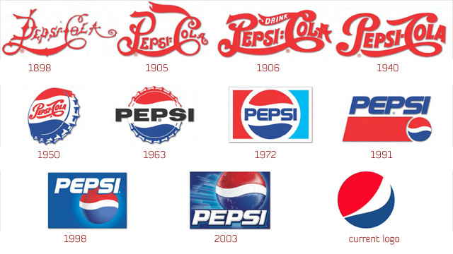
Today, one of the biggest soft drinks company, was first started by Caleb Bradham in 1890’s. Initially named as Brad’s drink the name was quickly changed to Pepsi-Cola, which is visible in the first 1898 logo. Finally in 1903, the name was trademarked and hasn’t been changed till date.
In the early years, Brad made custom logos for the brand as it became more famous. In 1933, the company was bought by Loft, Inc. The company changed the bottle size from 6 to 12 oz. and came up with the ‘Refreshing and Healthful’ logo.
However, the major breakthrough in the Pepsi logo design came in 1940’s. Walter Mack, the CEO of Pepsi came up with the idea of a new bottle design, with a crown having the Pepsi logo. The ‘Pepsi Globe’ emerged during WWII, as a way to support the country’s war efforts, Pepsi had a blue, red and white logo.
This logo became hugely popular, and went on to be the identifier for the company. As a result, in 1950 and 1962, this bottle cap with the swirling blue and red became prominent in the company logo. During the 1960’s when it became even more popular, the script was changed from the curly red, and the main attraction was on the bottle cap in the logo.
In 1991, the typeface was moved from inside the globe. The red bar was lengthened and the typeface appeared on the top of the globe. In 1998, the white background in the logo was replaced by the blue color, which also resulted in dropping the red horizontal band. The globe now had 3D graphic and larger than earlier versions.
After 1998, it seems that Pepsi had decided to give the globe more prominence than the script itself. So, the globe came on top of the script in 2003, and in their current logo they have done away with the script altogether.
Adobe
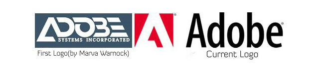
In 1982, forty-something programmers John Warnock and Charles Geschke quit their work at Xerox to start a software company. They named it Adobe, after a creek that ran behind Warnock’s home. Their first focus was to create PostScript, a programming language used in desktop publishing.
When Adobe was young, Warnock and Geschke did everything they could to save money. They asked family and friends to help out: Geschke’s 80-year-old father stained lumber for shelving, and Warnock’s wife Marva designed Adobe’s first logo.
REUTERS
 The rounded piece – or roundel – was developed in 1996 as an icon to increase Reuters visibility on computer and TV monitors, and as a way to brand the company’s on-screen services using far less space.
As originally conceived, the roundel was intended to resemble an abstract globe, representing not only the worldwide nature of Reuters business, but also the continuous collection, processing and distribution of information, 24 hours a day (with the dots representing information, and the two hemispheres of the globe representing day and night). Moreover, the left side of the roundel was meant to refer to the openness and transparency of the company; a visual way of portraying Reuters integrity.
But in 1999 the dots in the name were joined to create greater recognition, particularly on screen where the dot logo often disintegrated in its former form. The typeface was designed especially for Reuters and called, appropriately, Julius.
Today, the dots live on in the roundel, and the logo is more visible – and more relevant – than ever before.
SONY
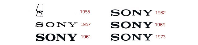
The first version of the SONY logo, which was enclosed in a square box, was registered as a trademark in 1955. Thereafter, the logo went through a succession of changes. In the 1960s, when Sony began to seriously develop its brand image overseas, the logo was displayed in neon in New York and Hong Kong, where it competed with famous and well-established foreign companies. In 1959, the catchphrase “Sony — a worldwide brand born in Japan” was introduced to capitalize on the logo. This was followed by the slogan, “Research Makes the Difference.”
To develop an even more effective logo, a committee was formed within Norio Ohga’s Design Division. By 1962, corporate identity (CI) rules and a design policy for the use of the Sony logo were established. After making numerous attempts to modify the logo, the company decided on the current version, which was introduced in 1973.
In order to mark the 35th anniversary of the company in 1981, there was a proposal within Sony to introduce a new logo. Although ideas were submitted from all over the world, Ibuka decided that none of the designs was better than the original one which had been in use since 1973. Consequently, the 1973 logo was kept, and it is still in use today.
Nokia

‘Nokia’ in Finnish means means a dark, furry animal we now call the Pine Marten weasel. However, this has little to do with the current business and brand image. The origin of the company name, can rather be attributed to the setting up of the wood pulp mill (set up by Knut Fredrik Idestam), on the banks of Nokianvirta river in the town of Nokia.
The Nokia Corporation was formed as a merger of Finnish Rubber Works (which also used a Nokia brand), the Nokia Wood Mill, and the Finnish Cable Works in 1967. The company has sold a variety of products in the past including television, shoes, car tires and others. The evolution and the meaning of the logo is unclear due to the changing business over the years.
Mercedes Benz

In 1902, the logo for Mercedes was nothing more than the simple company name. However, it was changed to a 3 pointed star in 1909. The origin of this star came from a postcard by Diamler, where he had drawn a 3 pointed star which represented ‘making vehicles in land water and sky’.
After 1926, a new symbol for Mercedes-Benz came into picture, where the original logo of both the companies was merged into one. It combined the 3 pointed star of Mercedes and the laurel wreath of Benz.
BBC

BBCs first attempt at branding came in 1953 when Abram Games was commissioned to design the BBC’s on-screen identity. He was famous at the time for designing the logo for The Festival of Britain of 1951.
His Television Symbol was a brass model whose centre circles could rotate. For BBC Scotland the spot in the middle was replaced by a lion. There were also other regional variations as well as a matching clock.
This new “bat wings” logo replaced the BBC coat of arms on screen, and would be seen before almost every programme.
Yamaha
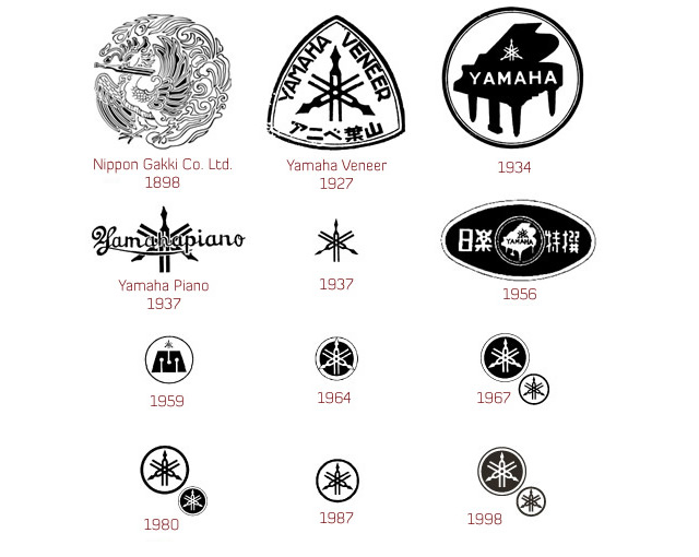
The three tuning forks of the Yamaha logo mark represent the cooperative relationship that links the three pillars of there business — technology, production, and sales. They also evoke the robust vitality that has forged a reputation for sound and music the world over, a territory indicated by the enclosing circle. The mark also symbolizes the three essential musical elements: melody, harmony, and rhythm.
Nike

Nike probably got the best deal amongst all companies when Caroline Davidson designed its logo for just $35 in 1971. The main part of the logo hasn’t really changed with time. They waited 7 years before finally improving the logo by no longer having the text and the swoosh overlapping each other.
As the brand gained recognition, the company name was dropped from the logo, which made it more simplistic and memorable. The company has different variations of this logo for its various departments like Skate, Soccer etc.
General Electric G.E.

The basic logo font face is still quite similar to what it was in 1892. Over time, a circle engulfing the company name has been added to the logo, which might be due to the increasing global presence and vision of the company. The current logo, which was designed by Wolff Olins, adds blue color to the logo instead of the black which had been used in all the previous logos. Accompanied with the logo change was also a change in the tagline of the company from “We bring good things to life” to “Imagination at work”.
Master Card

In 1966, seventeen bankers formed a federation for the reciprocal acceptance of their credit cards – called Interbank. The ‘i’ was used to identify the participating members of the Interbank Card Association.
In 1969, the name was changed to Master Charge. The new logo had the two familiar intersecting circles with the ‘i’ being retained at the bottom to show continuity and also to make it easy for people to recognize their earlier familiar logo.
Finally, in 1979, the name MasterCard was adopted and the ‘i’ was finally dropped from the logo. In 1990, bold colors were introduced which also made it easier to recognize the 23 horizontal bars between the two circles. As a result the logo looks more contemporary and simple, with an italic, sans-serif typeface.
In 1996, with further tweaking, Master Cards visibility, recognition, and overall brand image has greatly improved, with new features including larger lettering highlighted with a drop shadow, fewer interlocking bars within the red and yellow circles, and a new dark blue background for use on decals and signage.
Shell

Back in 1900, when Shell was launched the logo was a realistic and simple shell which lies flat on the ground. The evolution of the logo began after 1915, when rendering enabled the company to reproduce its identity easily. This is visible in the 1930 logo for the company. It added the red and yellow colors to the symbol, which are the colors from the Spanish flag where many Californians originated from, which might have helped the company to create an emotional bond with the people.
With the advent of internet and fax machines over the later years it became necessary for the company to simplify their logo. The 1971 logo designed by Raymond Loewy is very simple as compared to the earlier logos making it more memorable and recognizable.
Volkswagen

The first Volkswagen logo was designed by Franz Xavier Reimspiess, a Porsche employee during an office logo design competition. The core of the logo hasn’t changed much, but understandably after the WWII, they dropped the design around the circle which seems to be inspired from the Nazi flag. The fresh colors that were added to the logo in 2000, which depicts a positive change in the company and the ability to adapt to the new millennium.


